The Art of the Post: Looking Back at Those Glorious Black and White Illustrations
Read all of art critic David Apatoff’s columns here.
Americans were so dazzled by the invention of color movies that they almost forgot what made black and white movies great.
Technicolor arrived in the 1930s, and its rich, saturated colors opened a whole new world to moviegoers who were accustomed to seeing movies only in black and white. As years went by, black and white movies began to seem boring and old-fashioned. Children refused to watch them. In 1986, when mogul Ted Turner bought the rights to MGM’s movie archive, he announced that he was going to colorize the classic black and white movies to make them popular again. “I’m colorizing Casablanca,” he told the Los Angeles Times. “Once people start watching the colored version, they won’t bother with the original.” Directors and actors were outraged; they argued it would be sacrilege to colorize movies such as Citizen Kane, but Turner responded, “The last time I checked, I owned the films that we’re in the process of colorizing. I can do whatever I want with them, and if they’re going to be shown on television, they’re going to be in color.”
After a heated public debate, the public began to appreciate that color movies lacked some of the special qualities of black and white movies. For example, the art deco films of Fred Astaire and Ginger Rogers had a glamour that color movies could not match. The deep shadows and gritty tone of film noir movies simply couldn’t be achieved with color. Today, some directors prefer black and white for making serious artistic statements, with movies such as Manhattan (1979), Raging Bull (1980), Schindler’s List (1993), or the currently acclaimed Roma.
Just as the arrival of color transformed the film world, the arrival of color transformed the illustration world. Today, no one would consider buying a magazine with black and white pictures. But throughout the 19th century and well into the 20th, The Saturday Evening Post and other magazines thrilled readers with black and white illustrations. Some of the most gifted artists of their era were virtuosos with black pencil, charcoal, or ink. They appreciated the special qualities of black and white that have been drowned out today in the clatter of bright colors and special effects.
Here are some examples of those great early black and white illustrators, mostly forgotten today, whose work shows the special qualities of black and white art:
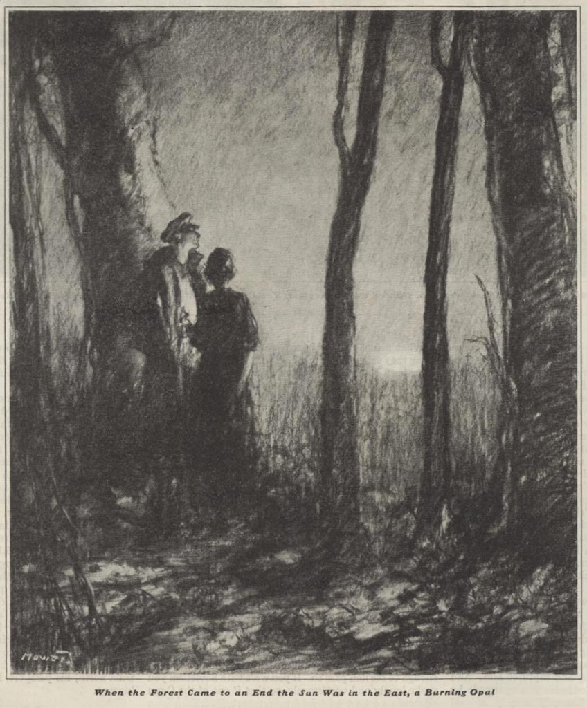
H.J. Mowat (1879-1949) was an illustrator popular in the 1920s and 30s. He created a wonderful mood with his black and white drawings. For example, his romantic pictures often involved a black sky with a white moon, or couples in black and white formal wear.
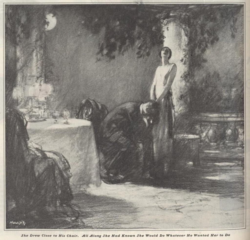
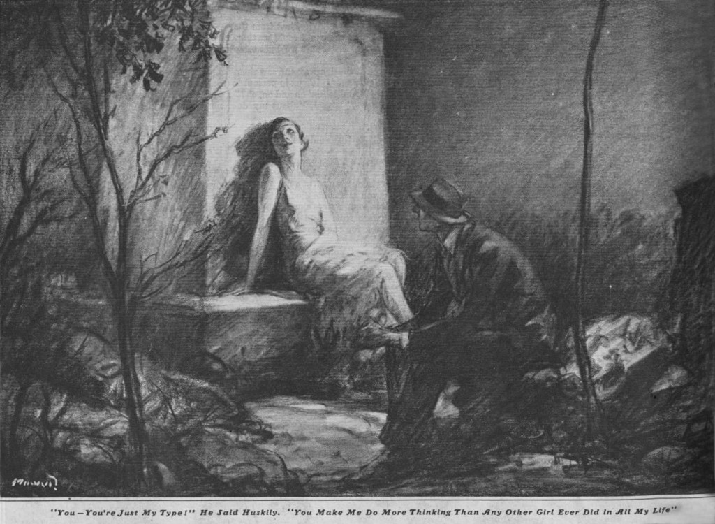
Even when the story described vivid colors, such as a sun like a “burning opal” Mowat’s pencil drawings could inspire our imaginations:
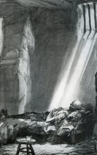
Another popular illustrator for the Post, Henry Raleigh (1880-1944) drew this dramatic illustration of a political prisoner. If he had painted this picture in colors, it would have softened the harshness and the despair of the situation.
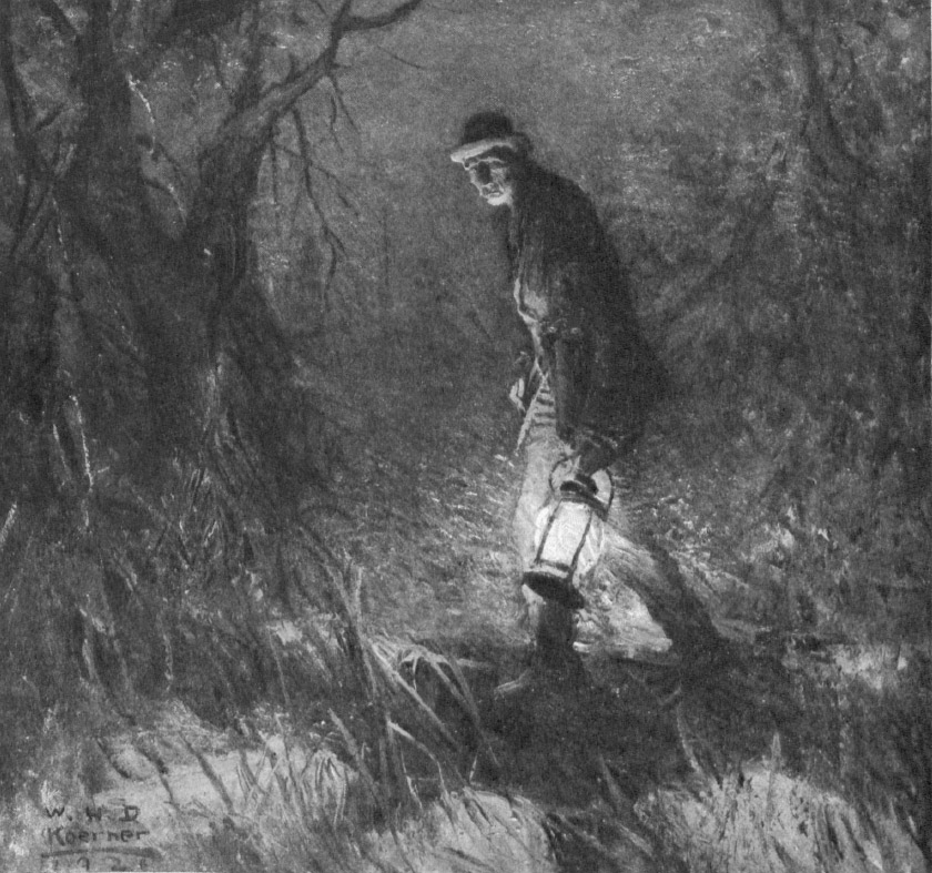
Another great talent, now largely forgotten, was William Henry Koerner (1878-1938). Notice how Koerner makes the maximum use of black and white in the dramatic lighting of this night scene:
Another prime example of the use of black and white is in this picture of a blinding snow storm:
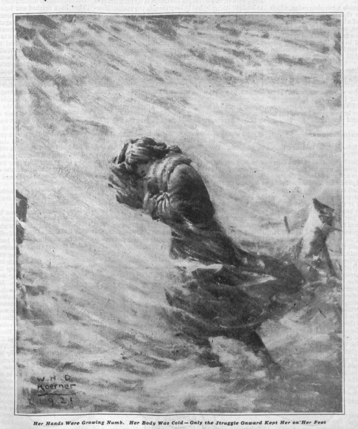
Can you imagine how these pictures would be weakened if they were in full color?
Audiences may have temporarily abandoned these kinds of pictures for the same reason that moviegoers temporarily stopped going to black and white movies. A black and white palette does have its limitations, but those limitations can inspire the imaginations of viewers in remarkable ways. A full color painting does much of the work for us and presents us with a fait accompli, but a pencil line is an incomplete suggestion; it requires viewers to fill in the blanks.
The limited palette of black and white sometimes requires more from the artist, too. The artists described above, and several of their peers working at the Post often had to be more inventive in order to get their message across in mere black and white. This affected how they selected a focus, how they staged their picture, and how they found artistic solutions for their assignments.
Rather than assume that black and white illustrations are boring or second class, give them a second look. Stark, high contrast line drawings have their own power, and even the gray of pencil shading can contribute a silvery sheen to a picture. These artists bygone artists did superb work using a limited medium and continue to deserve attention today.
The Art of the Post: From the Pages of the Post to Museum Walls
Read all of art critic David Apatoff’s columns here.
The illustrations that appeared in The Saturday Evening Post were intended to last until the next issue came out. The Post was a “periodical,” designed only to fill a period of time until it was updated by a newer issue containing more current information, fashion trends, and merchandise for sale.
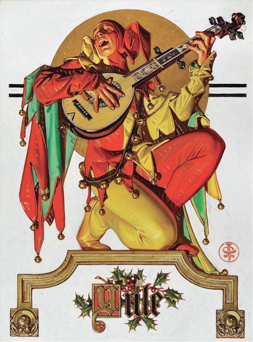
Generations of illustrators created beautiful pictures to fill the Post and other magazines, but it was always understood that they were creating temporary art; one day that thin magazine paper would turn brittle and yellow with age, and eventually crumble and return to mother nature.
It took a while for experts to recognize that illustrations had enduring value, but once Norman Rockwell’s 1951 cover for the Post, “Saying Grace,” sold for $46 million, even the most stubborn nay-sayers realized that this “temporary” art form was worth preserving.
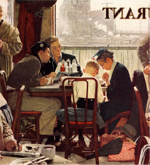
Today illustration art is being rescued and conserved by experts, to take its rightful place on museum walls.
During the decades when Rockwell and other illustrators were exiled from “fine” art, thousands of drawings and paintings were saved from the trash heap by a hardy band of collectors and artists who had the courage to ignore the condescension of highbrow art critics. These collectors weren’t intimidated by labels. Instead, they collected for the best possible reason: they loved the images. Their love of the pure art made them fearless, and they helped preserve the art form in private collections while the experts slowly had a change of heart.
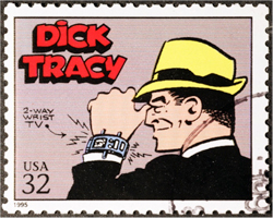
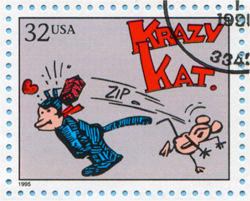
One such collector was Andrew Sordoni III, who started out as a young boy smitten by the art in Sunday comic strips. He liked Dick Tracy and Krazy Kat and a handful of other strips that were delivered to his house in the funny papers. Fortunately, Sordoni’s mother was a fashion illustrator, and she taught him to respect the craft of good drawing. For many years “craftsmanship” was a dirty word in the fine arts community, but it served as a polar star for Sordoni’s collecting. Soon Sordoni began collecting unfashionable illustrators such as Maxfield Parrish. Today Parrish paintings have sold for millions of dollars.
 |
 |
|
U.S. postage stamps featuring comics Dick Tracy and Krazy Kat. (Shutterstock) |
|
A lifetime of collecting has come to fruition in an opening this month of a large exhibition of American illustration art at the Sordoni Art Gallery in Wilkes-Barre, Pennsylvania.
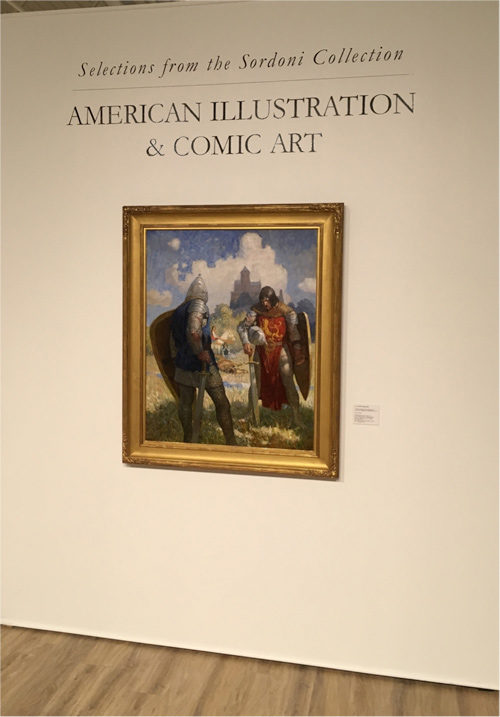
The show, which features one of the great private collections of American illustration, will run from April 7 to May 20, 2018. It was curated by Stanley I. Grand, Ph.D., a professor of art history and expert on the allegorical engravings from Giovanni Battista Ferrari’s De Florum Cultura.
The Sordoni show includes 135 works of art, including a number of illustrations that were originally seen in the pages of the Post, but which now can be seen as the artist created them.
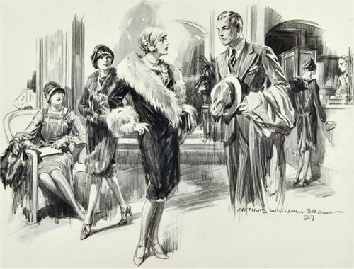

The collection reflects the personal taste of Sordoni, who collected what was once ignored as “lowbrow art.” As the catalog notes, “Andrew found his own way and collected works that were considered of lesser importance at the time, but are now highly regarded both in market and aesthetic terms.”
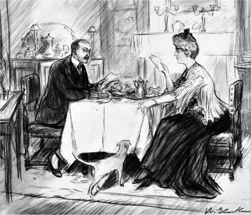
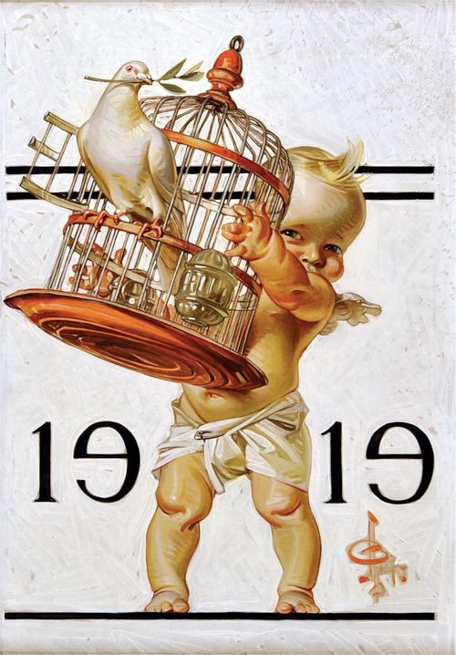
The art in the exhibit includes work by famed illustrators such as Rockwell, Parrish, and N.C. Wyeth. The substantial catalog accompanying the show is a prime example of how critical attention surrounding the field of illustration art has evolved from initial skepticism to serious study by respected academics and biographers who are devoting years and substantial critical analysis to multiple biographies.
While Rockwell was a groundbreaker in being accepted by the “fine” art community, other illustrators whose work appeared in the Post are hot on Rockwell’s heels. Artists such as J.C. Leyendecker, Dean Cornwell, Bernie Fuchs, Robert Fawcett, and others all have their own coffee table art books now, and the value of their original work at auction has increased dramatically. While illustration art was once auctioned in a separate category, much of it is now commingled and sold interchangeably with traditional American “fine” art.