Sex sells. Desirable women, rugged men, and suggestive slogans have all been a part of advertising for more than a century. This collection of vintage cigarette ads reveals some of the ways tobacco companies used sexual themes and risqué imagery to sell cigarettes.
The tobacco industry began using such tactics in the 1880s when they began printing pictures of women in costumes on the piece of cardstock used to hold the shape of the cigarette pack — a precursor to baseball cards.
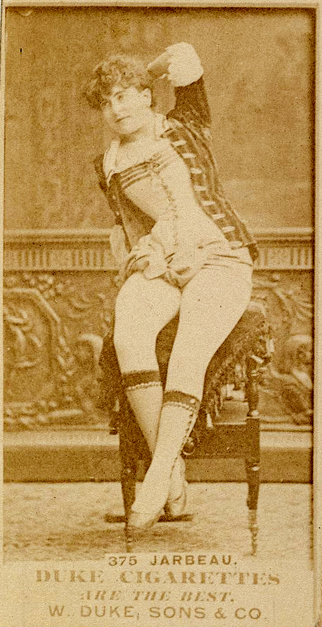
Duke, Sons & Co. was the leading cigarette brand in the 1880s and early 1900s. The cardstock images they included in their packages became collectors’ items.
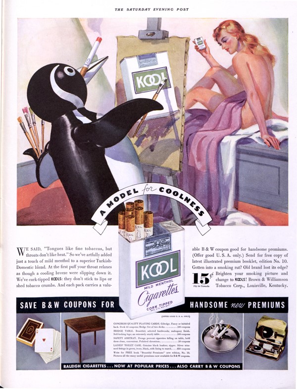
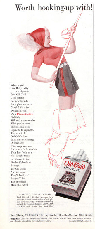
Headlines in tobacco ads were often double entendres, inviting readers to decide whether they were talking about their product or the person pictured in the ad.
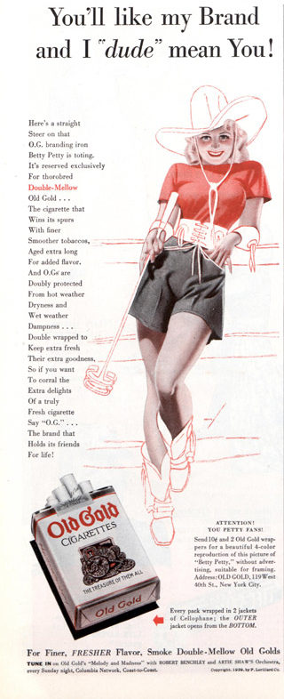
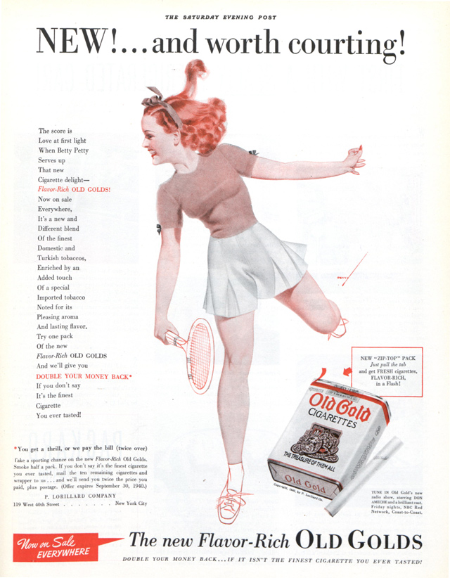
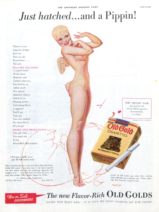
Tobacco companies often chose attractive women to star in their ads to attract the male audience. Although sexual references primarily targeted men, they also lured women.
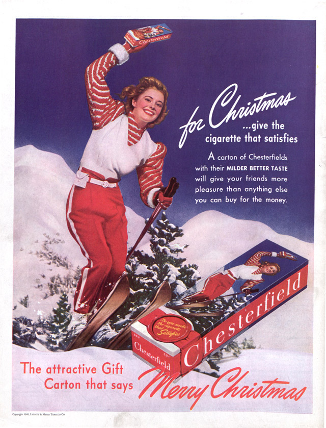
According to studies done in 2007 by Stanford Research into the Impact of Tobacco Advertising (SRITA), women were manipulated to believe that if they smoked cigarettes, they would be sexier and more attractive to men.
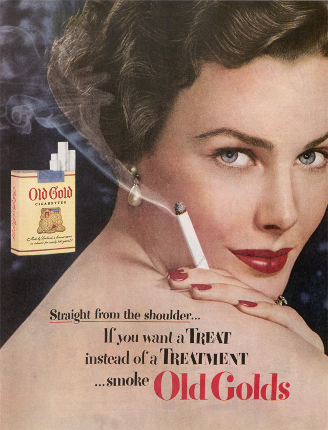
SRITA also found that if tobacco companies used slim women with fashionable clothes, women would be enticed to smoke.
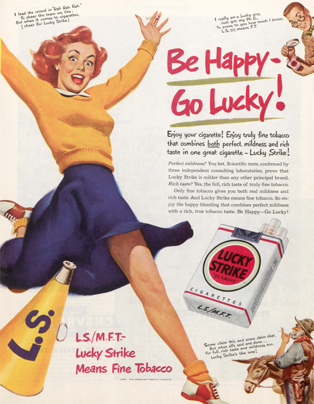
Research shows that sexual imagery tends to grab consumers’ attention more quickly than a non-sexual ad and holds their attention longer. A study done by the University of Georgia (UGA) concluded that sex really does sell.
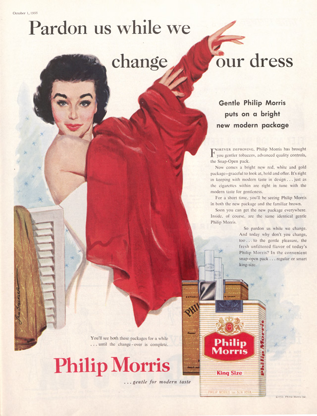
A UGA researcher explains that “people succumb to the ‘buy this, get this’ imagery used in ads.” They subconsciously believe that buying the product will make them as attractive as the people portrayed in the ads.
So what exactly were tobacco companies selling? An image, a fantasy, sex. And maybe a cigarette or two.
Become a Saturday Evening Post member and enjoy unlimited access. Subscribe now

Comments
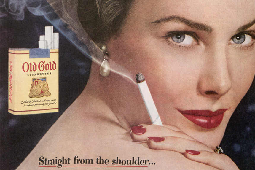
the 1950 old gold ad looked like a movie star/was the model well known or unknown?
I REALLY hate cigarettes with a passion Ms. Padilla, but do love this feature. That doesn’t make me a hypocrite, it just means I’m ad savvy. Alrighty then, I love the artwork for the 1936 KOOL ad. Risque for 82 years ago, the nudity would cause today’s uptight-about-everything Americans to do what they do best: freak out!
The penguin was a good distraction in the ad. Perhaps he’s why it got past the censors. If anyone else here loves ’80s advertising, check out the ‘I Wanna Pop’ Shasta TV commercials from 1983. One of them features penguins as only a 1983 era ad could!
Old Gold paid Petty plenty to feature women with nice racks, but not go too far. The more sophisticated 1950 ad not only featured a beautiful woman, but showed her holding the lit cigarette AND the smoke itself. The Lucky Strike ad from the same year just looks goofy to me, sorry.
The bottom one from ’55 kind of looked like ‘Butterfield 8’ five years early. Pardon us as we change our packaging to be colorful and stand out a lot more, so we’ll catch your eye to buy OUR cancer sticks that much faster. Oh, but don’t worry, as the main sponsor of ‘I Love Lucy’ you’ll be hearing all about it on TV as well!