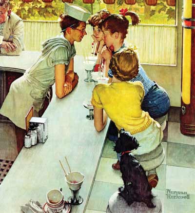
Rockwell’s inspiration for this August 22, 1953, cover illustration grew out of stories his son Peter told of working a soda counter one summer. Peter even posed as the young man when Dad painted the scene. When his father showed him the final product, Peter didn’t like it. He claimed he “wasn’t that goofy looking.”
In an earlier draft of the illustration, the counter was more crowded. A gentleman’s balding head was visible in the foreground, and a mother and son sat at the far end of the counter. But Rockwell removed them so he could draw viewers’ attention to the mid-canvas drama, where a boy and three girls stare at each other across a counter with rapt attention.
As always, Rockwell adds numerous masterful details, like the reflection of the sugar dispenser in the napkin holder, the grated floor that would prevent slipping on spills, and the vintage Wurlitzer jukebox just visible at the right edge. And that man in the corner? We can pretty easily guess what he’s thinking: Hot fudge! Ice cream! Girls! Why weren’t there summer jobs like this when I was young?
This article is featured in the July/August 2018 issue of The Saturday Evening Post. Subscribe to the magazine for more art, inspiring stories, fiction, humor, and features from our archives.
Become a Saturday Evening Post member and enjoy unlimited access. Subscribe now


Comments
WAS A ROCKWELLLL COLLECTOR IN MY YOUNGER DAY WHEN I HAD MONEY I COULD SPEND – I HAVE 56 COLLECTOR PLATES OF ROCKWELL IMAGES AND RIGHT NOW AM GOING THRU THEM TO LEAVE THEM TO MY 45 GREAT GRANDCHILDREN IN MY WILL. I LOVE THE PLATES SO MUCH IT IS VERY DIFFICULT TO IMAGINE I AM GIVING THEM AWAY. ONLY HOPE THE RECIEPANTS LIKE THEM AND CHERISH THEM AS ROKWELL MEMORIES AND NOT BECAUSE I LEFT THEM TO EACH1